
This part of the tutorial follows Part A: Apply and reorder tracks. Part B demonstrates how the results of one track can be corroborated by looking at a similar graph from another track.
So far, only the synopsis row for each track is visible in the Analysis view.

- To view the individual graphs, click the plus signs (
![]() ) to the left of the first three synopses. The individual track graphs are now displayed below each synopsis. The name of each graph appears on the right of the Analysis View.
) to the left of the first three synopses. The individual track graphs are now displayed below each synopsis. The name of each graph appears on the right of the Analysis View.
 ) to the left of the first three synopses. The individual track graphs are now displayed below each synopsis. The name of each graph appears on the right of the Analysis View.
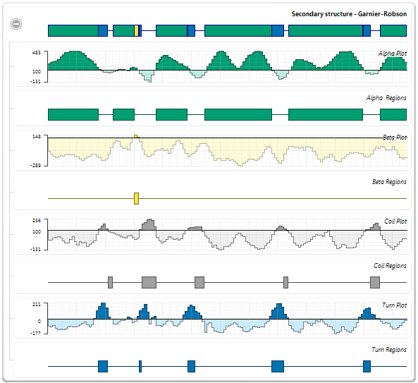
- To rescale the display so that you can view it more comfortably, use the zoom sliders located on the top and left sides of the Analysis view.

- Examine the Garnier-Robson and Chou-Fasman “Turn Region” plots. These plots show the predicted turn regions, and thus, the probable calcium binding regions for the protein sequence. (The plots are shown as adjacent in the graphic below, but they are not actually adjacent in the Analysis view).
 (Garnier-Robson)
 (Chou-Fasman)
- To verify which turn regions are the same in both tracks, select the Chou Fasman “Turn Regions” by holding down the Ctrl or Cmd key while clicking once on each of the six blue boxes.
- Visually follow the highlighting upwards to see corresponding turn regions highlighted in the Garnier-Robson track.
Of the six turn regions found in Chou-Fasman, four are nearly exact matches (shown by red boxes, below) with the turn regions in Garnier-Robson, and another is a close match (shown by red circles, below). Thus, the Garnier-Robson track provides partial corroboration of the turn regions from the Chou-Fasman track.

Proceed to Part C: Edit Track Options.
Need more help with this?
Contact DNASTAR