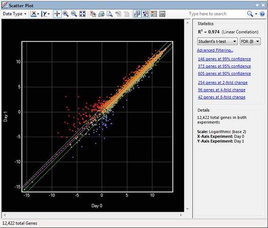
To access the Scatter Plot view, choose Graphs > Scatter Plot from the menu.
The Scatter Plot view is composed of several elements. The graphical display on the left is discussed in this topic. The toolbar tools above the graphical display and the Info Pane on the right are described in separate topics.

In the Variants workflow, the Scatter Plot gives a visual comparison of gene level variation between any two samples. Each data point on the Scatter Plot represents an individual gene and the “signal” for gene is the sum of the weighted values for each class of variation: each synonymous SNP adds 1 to the signal, each non-synonymous SNP adds 100 and each nonsense or frameshift causing SNP adds 10,000. Values are halved where the change is heterozygous.
For non-Variants workflows, ArrayStar’s Scatter Plot view gives a visual comparison of gene signals between any two datasets; whether they are individual arrays or replicated sets. Each data point on the Scatter Plot represents an individual gene and is plotted based on its signal in both of the selected experiments.

If DESeq2 or edgeR normalization was used, data are visualized in the scatter plot using the rlog (log2) value for each gene. For all other workflows, data are visualized on a simple log2 scale. However, data can also be scaled and visualized as linear by changing the scatter plot style settings. In general, a log2 scale can facilitate visualizing data that covers a large span of values by reducing it to a more manageable range.
Three solid green lines are drawn diagonally across the scatter plot. The middle green line is the identity line, or the x=y line.
•For non-Variants workflows, data points on the identity line represent genes that are expressed at the same level in both data sets. The other two lines delineate genes with at least a two-fold change in intensity value in one of the data sets.
•For the Variants workflow, points lying on the identity line indicate those genes in both samples that have the same total number of SNPs, with the same class distribution. The other two lines delineate genes where the weighted sums vary more than two-fold.
The dashed purple line on the scatter plot is the linear regression (R2) or “best-fit” line, a line that passes as near to as many data points as possible. The Scatter Plot only displays the value for the currently-selected pair of experiments in the view. By contrast, the Cross-R2 test creates all of the "crosses," or pairs, and produces a table. The R2 results for both the Scatter Plot and Cross- R2test use the same statistical calculations.
Each data point is colored to reflect where it is in comparison to the x=y line. The colors for data points, as well as the fold lines and regression line can be changed to match your preferences.
Right-click on the Scatter Plot to access the following context menu commands:
|
When this many genes are selected |
… these commands are available |
Command description |
|
≥ 0 genes |
Show Gene Table |
Shortcut to Data > Show Gene Table. |
|
Select All |
Shortcut to Edit > Select All. | |
|
Copy Image |
Shortcut to Edit > Copy Image of Graph or to
the Copy Image tool ( | |
|
Fit to View |
Same as using the Fit to View tool ( | |
|
≥ 1 gene |
Remember Gene Set |
Shortcut to Data > Remember Selected [Genes, SNPs, Table Rows, etc.]. |
|
Clear Selection |
Shortcut to Edit > Clear Selection. | |
|
Export |
Shortcut to File > Export Selected Genes. | |
|
Exactly1 gene |
Edit Gene ‘x’ Notes |
Launches the Edit Gene Notes dialog, already populated with the gene name. Equivalent to clicking on the “Notes (Edit)” link in the Details panel. |
|
Remove Gene ‘x” from Selection |
Deselects the gene. |