.
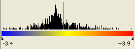
.The colors of the tiles in the Heat Map represent the measured expression value of a given gene in a given experiment. By default, a three color scale is used with blue indicating low expression values, yellow indicating intermediately expressed genes, and red representing highly expressed genes.
Colors in the color scale may be adjusted to fit your
preferences by selecting Graphs > Set Colors while the Heat Map is
active, or by clicking the Color Settings tool .
Greater color contrast can be achieved in the Heat Map by limiting the span of the color scale, either by standard deviations or by a percentage of the number of data points.
Specify a cutoff value for each end of the scale from the Style Settings dialog. Genes with expression values that are less than the left end cutoff value will be displayed as highly suppressed genes in blue, by default. Expression values that are higher than the right end cutoff value will be displayed as highly expressed genes in red, by default. Use the Color Settings dialog to customize the colors used for gene expression.
Once the cutoff values have been specified, activate the
limited color scale by using the  or
or  tools from the toolbar.
Per-row color scaling uses an independent color scale for each row in the Heat Map, which allows expression values for each gene to be displayed as the difference between each column and a specified baseline experiment.
To turn on/off this feature, click the Per Row Color
Scale tool  .
.
To specify a baseline experiment, right-click on the experiment column or experiment name shown above the column and choose Set as Baseline Experiment. Alternatively, double-click on the experiment name shown above the column.
When the per-row color scale+ is turned on, the histogram above the color scale in the Info Pane will show a dotted line at zero for the specified baseline experiment: